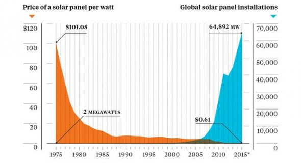
A new graph by Earth Policy Institute and Bloomberg – sourced via this story on Treehugger – offers a stunning reminder the incredible journey solar PV has been on over the past decade.
As the graph shows, the cost of solar PV – the orange part – 40 years ago was up around $US100 per watt, and a global total of only 2MW was installed.
Of course the cost of the promising technology falls rapidly from there, but global solar installations – the blue bit – barely register until that magic moment somewhere between 2000 and 2005, when price per watt reaches a tipping point and the blue bit soars to a total of just under 65,000MW in 2015.
 And as Treehugger’s Michael Graham Richard notes, “the beauty of having exponential growth on your side is that very quickly, even the current blue spike will look tiny. In 2020 or 2030 we’ll look back on 2015 and it’ll barely register as the beginning of the curve on the chart.”
© 2016 Solar Choice Pty Ltd