Pertinent news considering the upcoming Australian election, the Guardian UK has created an interactive map of solar power in Australia by federal electorate. The map is based on data from Australia’s solar industry consultancy Sunwiz and not-for-profit renewable energy campaigners 100% Renewable Energy. The map paints a fascinating picture of how much traction solar PV has gained in Australia in recent years (and where). It also serves as a powerful tool for informing many politicians just how much of their constituency has chosen to make an investment in solar power–this is ultimately the goal of 100% Renewable Energy’s Solar Citizens campaign.
Total number of solar systems & penetration of systems per region
The Guardian’s map has 2 modes for viewing: One which highlights the absolute number of residential solar panel installations per jurisdiction, and another which shows the percentage of solar homes by area. This makes it possible to see at a glance which states and regions are leading the way when it comes to solar power.
As we’ve noted before, South Australia is leading the way for solar (and other renewables) in the country, and accordingly stands out immediately on both versions of the map. Major urban areas, as well as a large swathe of regional Queensland, NSW, and Victoria seem to have been the main hotspots for solar system uptake.
(Further information about the electorates in the map can be found on the Sunwiz website.)
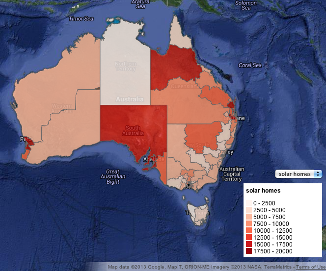
The Guardian’s solar map: Darker red areas have a greater number of solar homes. (Click to enlarge. Image via the Guardian.)
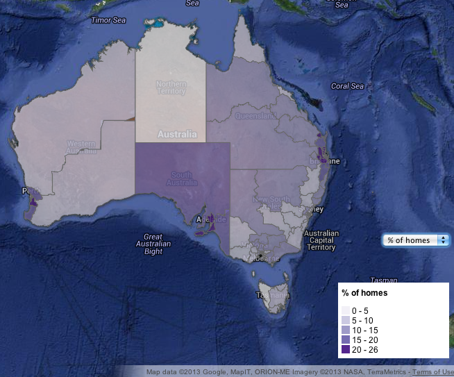
The Guardian’s solar map: Darker purple regions have a higher penetration of homes with solar installed. (Click to enlarge. Image via the Guardian.)
Other information in the solar map
By clicking on the various jurisdictions it is possible to learn not only the statistics about solar power uptake mentioned above, but also the total number of dollars invested in PV systems, power bill savings for the homes, and CO2 omissions abated. Data on median weekly household income for each electorate is also included. By perusing the map and keeping an eye on this figure through different electorates, it becomes clear that solar power is not simply the province of the wealthy–an oft-repeated criticism leveled against supporters of renewable energy subsidisation. Australia’s median weekly income is above $1,000.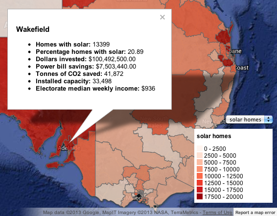
The Guardian’s solar map: Other details for each region. (Click to enlarge. Image via the Guardian.)
Explore the Guardian’s interactive solar map of Australia
The solar map originally appeared on the Guardian UK website. Click here to see the orignal interactive map. You can also use the map below.
All images via the Guardian UK
© 2013 Solar Choice Pty Ltd

He is now the communications manager for energy technology startup SwitchDin, but remains an occasional contributor to the Solar Choice blog.
James lives in Newcastle in a house with a weird solar system.
- Solar Power Wagga Wagga, NSW – Compare outputs, returns and installers - 13 March, 2025
- Monocrystalline vs Polycrystalline Solar Panels: Busting Myths - 11 November, 2024
- Solar Hot Water System: Everything You Need to Know - 27 February, 2024