The contribution of Australia’s 1.3 million rooftop solar systems can now be monitored in real time, with the launch of an updated solar mapping service by the Australian PV Institute.
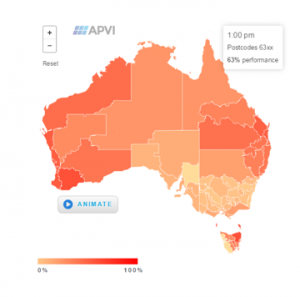
The newly enhanced version of APVI’s Live Solar PV Map – a tool originally developed in the lead-up to the Queensland election to track the contribution of systems in that state – now tracks the output of 5500 PV systems across Australia and their contribution to meeting electricity demand in real time.
The map, developed by the University of New South Wales in 2014 with financial backing from ARENA, incorporates live data from individual PV systems, the Clean Energy Regulator, PVOutput.org and now SMA Australia.
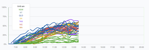
This data is combined to estimate the output of all PV systems in different regions of Australia, which is then compared to electricity demand in each state to show the percentage of load being met by PV.
The extra data also means that the live PV output is mapped by postcode.
“These improvements to the solar map will help increase consumer and electricity sector confidence in solar PV by providing better information on how, when and where the 1.3 million PV systems in Australia are generating emissions-free electricity and reducing demand peaks,” said Dr Anna Bruce from UNSW, the lead researcher behind the map.
“This will not only help to illustrate how householders can reduce electricity bills but also enable better integration of solar PV into the electricity system, which will help to reduce costs for everyone”.
Other new features of the Solar Map include:
– The addition of a Solar PV Status Map, which provides an interactive guide to the location, capacity and annual performance of PV installations across the country. It provides detail on installed capacity, percentage of households with PV, and estimated annual PV production by state, city (local government area) and postcode.
— The addition of a Solar Potential Tool, which allows stakeholders to assess the potential output from PV on urban rooftops. At a city level, insolation maps allow identification of the best roofs, while on a specific roof surface, an estimate of annual electricity generation, financial savings and emissions offset from installing solar PV can be obtained.
The interactive map also uses 3D spatial data to allow users to zoom down to rooftop level and see information about the shading from surounding buildings and trees, the tilt and orientation of roof surfaces and the solar resource available on each surface.
— The addition of Solar Animation, which provides a visualisation of the roll-out of solar across Australia from only 10MW total in 2007 to close to 3.6 GW in mid 2014; and
– Market Analyses and Postcode Data, to keep track of the progress and impact of the technology.
© 2015 Solar Choice Pty Ltd
