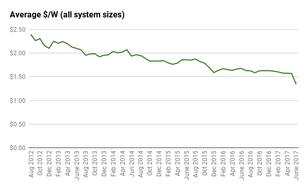
This month saw one of the sharpest drops to average system prices since Solar Choice first began keeping track in August 2012. Between May and June, the average system price dropped 23c from $1.57 per watt ($1.57/W) to $1.34/W. This sudden decrease stands in sharp contrast to the very gradual changes that we’ve seen over the past couple of years.
About the Solar PV Price Index
Here it’s worth reminding readers that our Price Index represents a sample of solar retailers in the broader market – the ones that work with Solar Choice. As such, fluctuations in pricing are a reflection of changes to our network composition as well as changes to pricing from installers who are active in the network. The Price Index is therefore less of a real-time spot market ticker and more of a bellwether of overall pricing trends. It’s also important to note that the prices are all indicative prices on offer by installers, and do not represent the average price of systems sold.
With these points in mind, there are two main reasons for the dramatic drop this month. The first is that one long-term member of the Solar Choice network active across multiple states on the east coast has left the network. Their offerings were generally on the ‘premium’ end of the spectrum, costing on average more than most others. The second reason is a significant price reduction (concomitant with a new product offering) from another installer also active in multiple states. Unusually, both of these things happened in the same month, against a background of slowly falling average system prices over the past year or so – thus resulting in the stark difference between this and last month.
How this decrease fits into the long-term trend
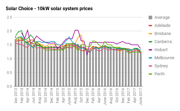
For some time now we have observed prices on the low end of the spectrum sink lower and lower across a range of installers and cities. Where $1/W was once an outlier in terms of system pricing and therefore worthy of a high degree of skepticism, in 2017 we see several solar installers offering systems in this ballpark – and not just within the Solar Choice network.
At the same time, we’re seeing prices on the ‘high’ end of the spectrum less and less likely to go above the $2/W threshold unless they are labelled by the installers themselves as ‘premium’ products or use microinverter/power-optimiser technology. Although few would have thought pricing like this to possible – or common – only a few years ago, it has come to be the reality.
Average prices would be even lower if we were to remove 1.5kW systems (usually the most expensive system size in $/W terms) from our monthly analysis; this is something we have considered doing but decided against mainly for reasons of consistency. Installations of this size were popular when solar installations were 3-4x the cost of today’s prices, but are fairly uncommon these days, as larger systems offer more value for money and virtually any unshaded roof is likely large enough to accommodate at least a 2kW system (also increasingly uncommon). The most popular system size these days by far is 5kW.
Without further ado, below is our usual monthly breakdown of residential solar system prices by capital city & system size.
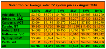
Average solar PV system prices for June 2017
Prices in the table below include both the up-front incentive available for small-scale systems through the Renewable Energy Target (STCs) and GST – they represent the total out-of-pocket cost of the system to the customer. We’ve left fields blank where there were only a small number of price points available in our database (usually fewer than 3).
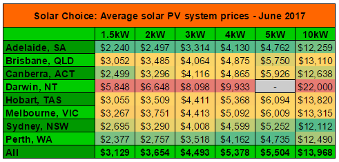
Prices for each system size are colour-coded. (Dark red for highest, dark green for lowest, yellow for middle. Note that for Darwin there is no 5kW pricing; this is because Darwin installers prefer to list pricing for 4.5kW systems instead, as there are additional hurdles for connecting solar systems above that size to the grid. We have recently revised our table to more accurately reflect this.)
Solar system prices for June: $/W medians, highs & lows
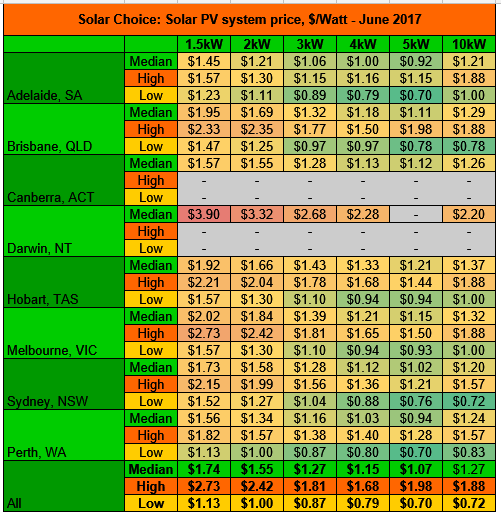
Prices above are colour-coded across highs, lows & medians for all cities and system sizes. (Dark red for highest, dark green for lowest, yellow for middle. Cells are grey where only a small set of data points was available.)
Historic solar PV system prices (since August 2012)
The historic pricing in the tables below do not reflect prices for Darwin, NT. See ‘About this data’ footnote below for a more detailed description of where this data comes from and what it represents.
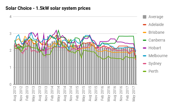
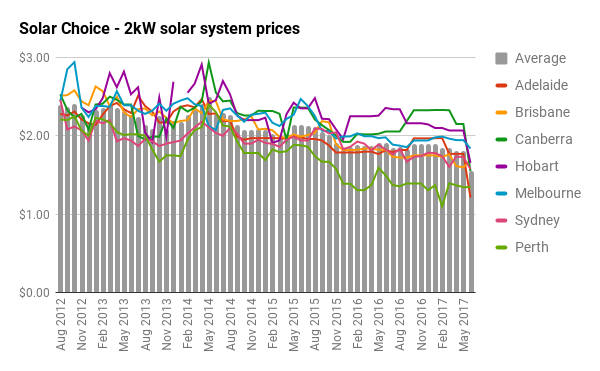
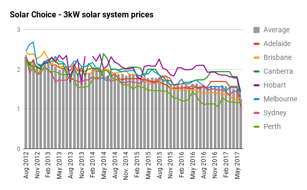
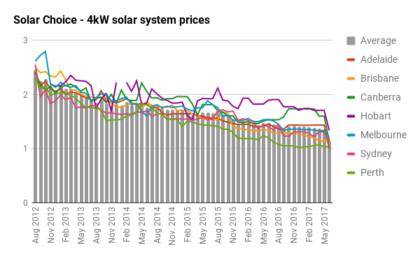
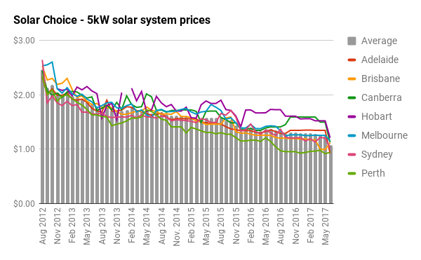
All $/W solar system prices (Historic)
The chart below provides an at-a-glance look at solar PV system pricing trends since August 2012. Data points are the average of average $/W for each system size (1.5kW-5kW until Nov 2013, then also including 10kW from Dec 2013).
(N.b. Please see note about ‘Solar Choice Discount’ in January 2016 edition of the PV Price Index.)
About this data
Tables and charts included in this article were compiled using data from Solar Choice’s installer network database, which contains regularly-updated pricing and product details from over 100 solar installation companies across Australia. Prices do not ordinarily incorporate meter installation fees or additional costs for difficult installations. ‘Premium’ installer offerings are excluded from calculations. Pricing data from Darwin is not included any of the charts showing historic trends.
© 2017 Solar Choice Pty Ltd

- Why a big battery could be cheaper than a small battery with the federal rebate? - 19 June, 2025
- Heat Pump Costs – Solar Choice Price Index - 1 June, 2025
- Solar Panel Costs: Solar Choice Price Index | July 2025 - 1 June, 2025
Are the prices provided after the STC credits applied or before?
Hi Steve,
All prices are final out-of-pocket prices for the consumer, so STC credit / federal discount is applied.
What would a standalone 5kw system cost supplying an entirely separate circuit totally isolated from mains supply.
Usage. – Daytime power to chiller/freezer and washing machine.
Battery storage to be applied later when more affordable.
Hi Robert,
The prices we’ve got on this page should provide a rough indicative baseline, but for a detailed assessment it’s something you’d need to speak with an installer about – feel free to get quotes through our portal by filling out the form on this page. You might also want to read a bit more about partial off-grid solar systems.