August 2016 marked four years since Solar Choice published our first Solar PV Price Index. What are some of the noteworthy trends we’ve seen over this period?
What is the Solar PV Price Index?
Solar Choice’s PV Price Index is a barometer of residential and commercial solar system pricing trends in Australia’s capital cities (with the exception of Darwin, which has only been included recently). The Residential PV Price Index tracks quoted prices for ‘small-scale’ (1.5kW to 10kW) solar systems, while the Commercial PV Price Index looks at 10kW – 100kW system prices. Since the Commercial PV Price only began in May 2014, this article focuses on residential trends.
The tables and charts in each edition are derived from indicative pricing figures posted by installers in Solar Choice’s network to our online database. All prices are inclusive of GST and the federal government incentive available through the Renewable Energy Target.
While numbers based on actual contracted sale prices (as opposed to indicative quotes) would clearly be a more accurate representation of what Australian homes and businesses are (or have been) paying for solar, unfortunately no such public record currently exists. The Price Index is the closest proxy to this sort of data currently available in Australia, and judging by how frequently it is cited, it has still proven valuable as a reference for the industry and consumers alike despite these limitations.
What’s changed in solar system pricing?
1. No surprise: Average prices have come down
It goes without saying for anyone who paid any attention to Australia’s solar market over the past few years, but the most obvious and unmissable trend is that prices are significantly lower now than they were in 2012. According to our data, the average residential solar system costs about 25-30% less to install now than four years ago – down roughly $0.60 per watt to about $1.67 from about $2.30.*
Keep in mind that as of August 2012, solar system prices had already come down dramatically from just two years prior. By the time Solar Choice started publishing data, residential solar power was already at the point where it had become an attractive investment for many homes even after most generous solar feed-in tariff incentives had closed to new applicants.
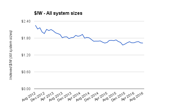
Dollar per watt price trends between August 2012 and August 2016.
2. Prices for small systems haven’t changed much since 2012 – while larger system prices have dropped significantly
Remember back when 1.5kW systems were the bread and butter of the Australian solar industry, and there was an STC multiplier that made smaller systems even more affordable? Long gone are those days – the average installed system size is currently between 4kW and 5kW, and this is where the most competitive pricing can be found.
Most interestingly, our data shows that average prices for 1.5kW systems have hardly budged in the last four years – falling on only about 8%. Low-end prices for systems of this size have actually increased a bit (by about 5%), and highs are only down by about 15%. This is probably due at least in part to installers not wanting to be bothered with installing smaller systems, combined with the fact that larger systems are already quite affordable – as well as being more likely to have an impact on the home’s electricity bill.
Contrast the stagnant pricing of smaller systems with average prices for 5kW systems, which have fallen by 35% since 2012. If we compare the high-end prices for 5kW systems from 2012 to those from 2016, we see a 51% drop; ‘low’ prices have fallen by 43%. The changes in 4kW system prices follow a similar trend.
We note again here that our numbers are a sample of the market, and do not encompass the full range of prices. The August 2016 ‘lows’ for 3kW, 4kW and 5kW solar systems all hover around the $1/W mark, but we have certainly heard about systems of that size for less (although we would advise anyone consider a system that cheap to proceed with caution). Prices in this range would have been unheard of back in 2012 – or if they were seen, they would have been looked at with an extraordinarily high level of incredulity.
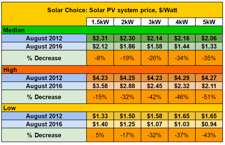
Percentage decrease in median, high & lower prices for a range of popular residential solar system sizes.
3. What about 10kW systems?
Because residential system sizes were much smaller back in 2012, a 10kW system would have been seen as slanted towards the ‘commercial’-scale end of the size spectrum. As such, we only started keeping track of 10kW system prices in the Residential Price Index in December 2013. During that time, average prices have come down by about 15%, while low-end prices have fallen by over 20%.
One thing that’s interesting (and kind of awesome) about this decline is the fact that a 10kW system is theoretically large enough to allow a highly energy efficient home to become mostly energy self-reliant, provided they install enough battery storage (although going off-grid should be approached with a healthy degree of caution).
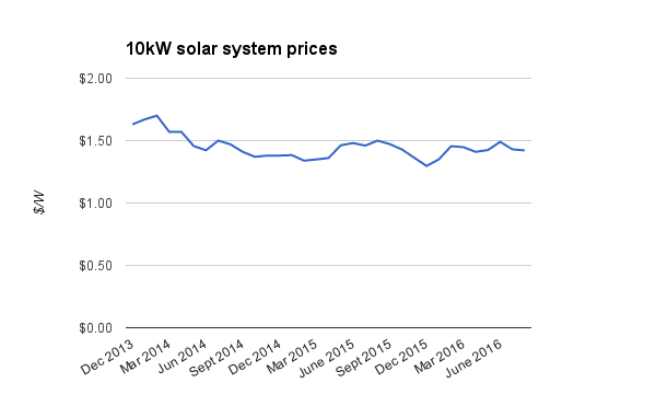
Average 10kW solar system prices since December 2013.
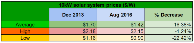
A quick comparison of 10kW system prices: Dec 2013 vs Aug 2016. Highs remain mostly unchanged, while average & low prices have fallen substantially.
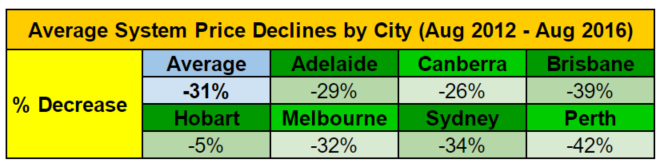
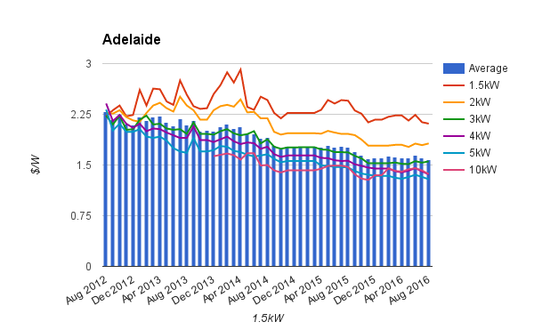
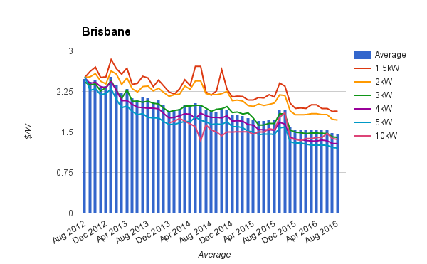
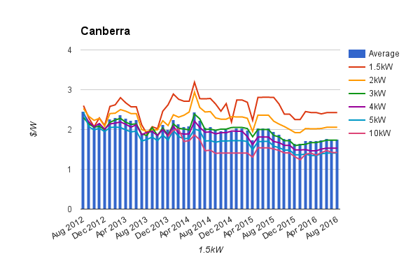
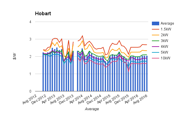
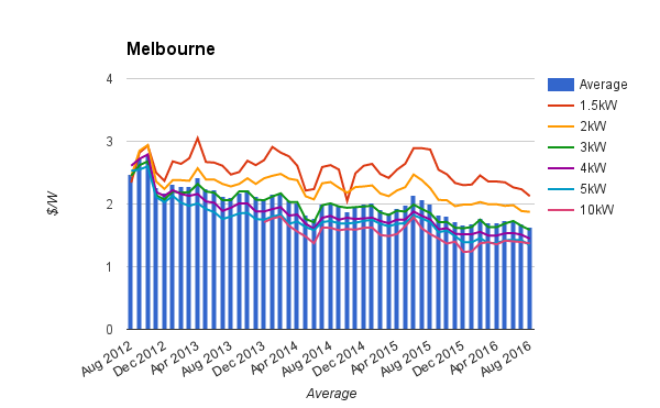
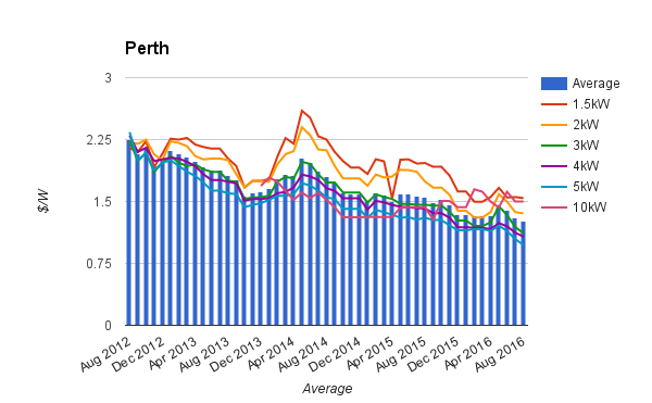
4. Prices fell more in some cities than others
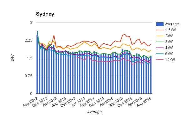
According to our numbers, prices fell most dramatically in Brisbane and Perth, while Hobart prices saw only a very slight decline. 1.5kW system prices saw little decrease or actually increased in Adelaide, Canberra, Hobart & Sydney, while the price declines in systems of other sizes were relatively regular and predictable.
The rate of decline has slowed for all cities and system sizes since the beginning of 2016, although it will be interesting to see where things head over the rest of the year – not to mention future ones.
*Unfortunately, due to poor record keeping on Solar Choice’s end (you can blame the author, James), we do not have exact numbers on the value of the ‘Solar Choice Discount’ which was once factored into our monthly calculations. Aiming to represent the ordinary market price for a system, we previously added the amount of the discount onto the ‘final total’ column in our tallies – the out-of-pocket expense of purchasing a system after GST and STCs were taken into account. We decided to cease this practice in December of 2015, leaving to a slight irregularity in our tracking of historic pricing trends. For the purposes of this article, we have assumed that the value of this discount was approximately 7c/W (actual average value of our spreadsheet from August 2012), but it may be marginally higher or lower. As such, please take the numbers and graphs in this article for what they are – a rough representation of the pricing trends of the past four years – and note that this glitch is probably the source of any inconsistencies you might notice in the figures.
© 2016 Solar Choice Pty Ltd

- Solar Power Wagga Wagga, NSW – Compare outputs, returns and installers - 13 March, 2025
- Monocrystalline vs Polycrystalline Solar Panels: Busting Myths - 11 November, 2024
- Solar Hot Water System: Everything You Need to Know - 27 February, 2024